Top PowerPoint Practices to Elevate Your Message
Imagine having a brilliant idea that could potentially reshape your company's future, but when it comes to presenting it using PowerPoint, you find yourself drowning in a sea of uninspiring slides. We've all been there – grappling with font sizes, bullet points, and mismatched colors.
The good news is that there's a way to transform your PowerPoint presentations from lackluster to impactful. In this blog post, we'll uncover the essential tools, practices, hints, and tricks that can help you create stunning and effective presentations that truly captivate your audience. We will also illustrate it with best practices from top professionals.
① Starting Strong: Defining Your Message
Before diving into design and aesthetics, it's crucial to establish a clear and concise message.
What is the core idea you want to convey?
What are the key takeaways for your audience?
Begin by outlining the main points you want to cover. This not only helps you stay on track but also guides the structure of your presentation.
In this informative video, renowned TV host and journalist, Mike Ploger, delves into the art of delivering a compelling presentation. He unravels the seven essential presentation skills and outlines a versatile framework used by top-notch speakers across a spectrum of scenarios, be it persuasive sales pitches, inspiring motivational speeches, or pivotal corporate gatherings.
② Choosing the Right Design: Templates and Themes
PowerPoint offers a range of templates and themes that can provide a professional and cohesive look to your presentation.
Start by selecting a template that aligns with the mood and purpose of your content.
While it's convenient, remember that customization is key.
Adjust colors, fonts, and layouts to match your branding or the tone of your message.

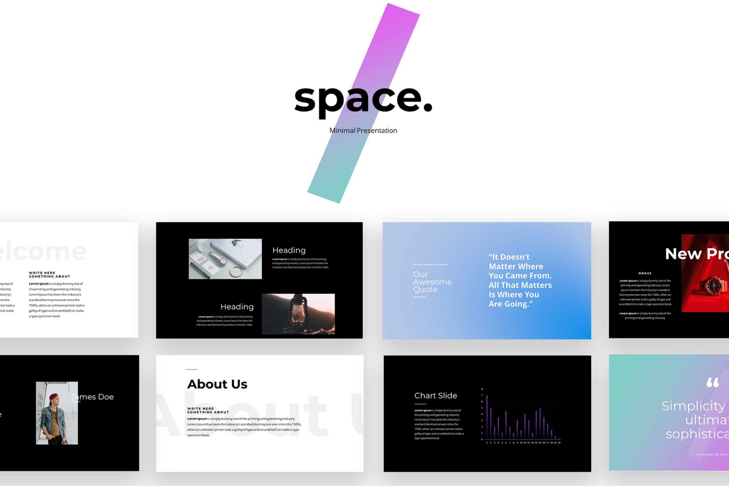
The template we developed for RSB includes over 50 templates with detailed usage guidelines.
③ Less is More: Simplify Your Slides
One of the most common mistakes in PowerPoint presentations is cramming too much information onto a single slide. Instead, focus on simplicity.
Each slide should convey one main point,
supported by concise text or visuals.
❌ Avoid lengthy paragraphs;
• opt for bullet points, short sentences, or even single words that capture the essence of your message.
This work by Chetan Verma is a good example of right balance of text and imagery. The balance makes it simple to apprehend the message and to clearly navigate in the structure of the document.
④ Visuals that Speak Volumes: Incorporating Graphics
Visual elements are potent tools for engagement. Incorporate:
🌌 images
📊 diagrams
📈 charts
☑️ and icons to convey complex ideas quickly.
High-quality visuals not only break the monotony of text but also aid in understanding. When using images, ensure they are relevant to your content and of sufficient resolution.
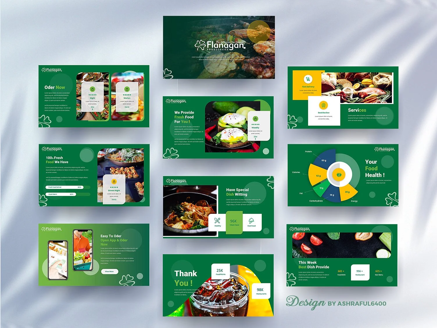
This design by Ashraful Islam is a good example of how to effectively blend the elements listed above. Thanks to a smart design solution, pictures of food, very vivid in colors, are successfully incorporated into the main theme, and the slides have a harmonious feel.
⑤ Consistency is Key: Formatting and Alignment
Consistency breeds professionalism. Pay attention to formatting details such as:
font sizes
colors
text alignment
A harmonious design throughout the presentation enhances visual appeal and makes it easier for your audience to follow along.
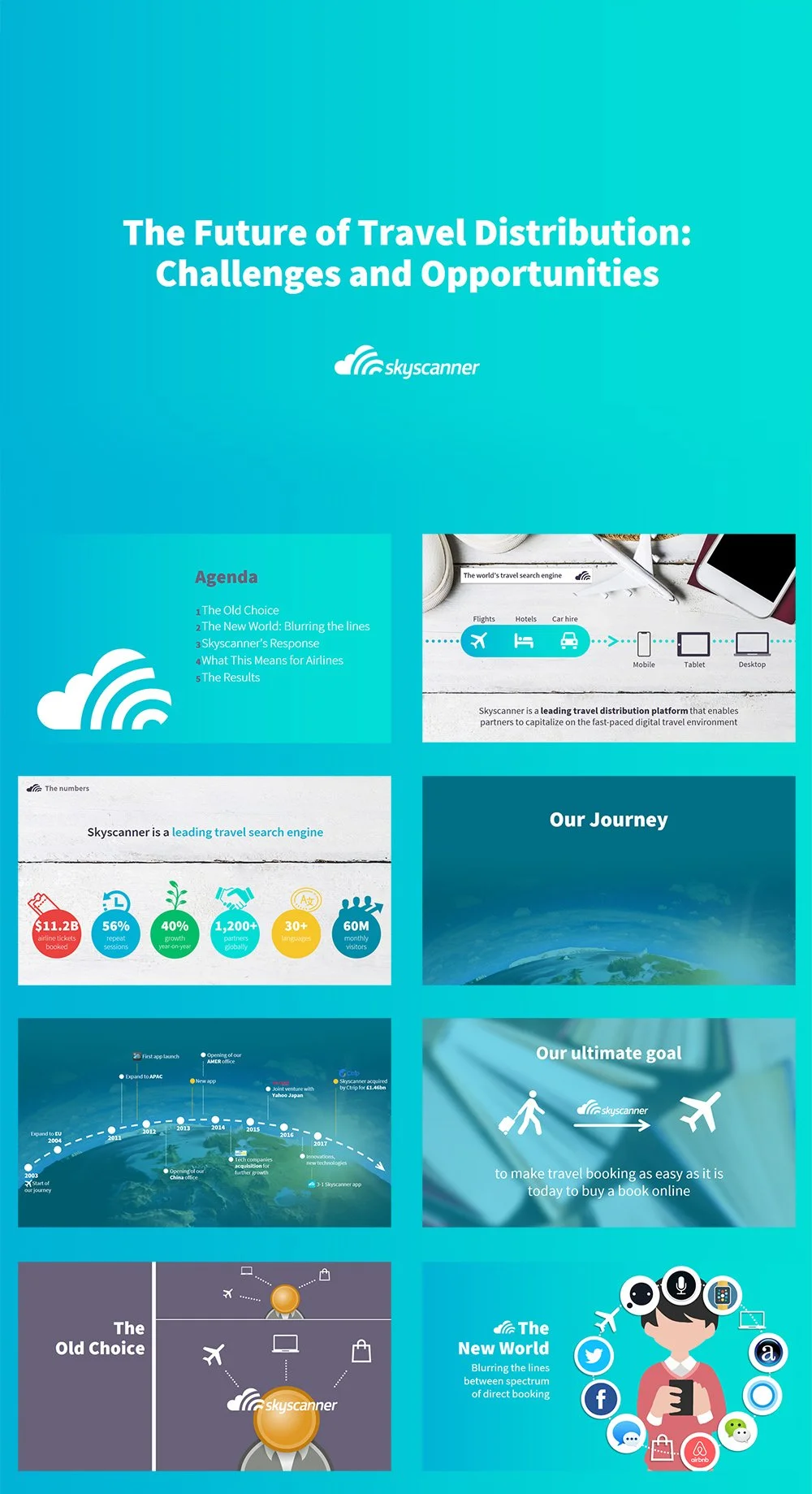
In this work for SkyScanner we created various graphics and layouts based on their brand guidelines. Fonts, colors and icons were chosen to respect the brand visual identity. Usage of visual elements like graphics or pictures is balanced by an extensive usage of same colors and fonts.
⑥ Mastering Text and Typography: Font Choices
The fonts you choose can significantly impact the legibility and overall look of your presentation. In case your company doesn’t impose to use a certain font for communication (yes, this is sometimes the case!), stick to one or two fonts for uniformity.
Choose a legible font for the main text and consider using a bolder or larger version for headings. Avoid using too many different fonts, as it can lead to a cluttered appearance.
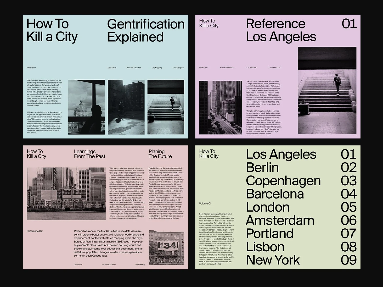
Look at how intelligently text blocks form a layout in this work by Marko Cvijetic. An effective balance between the title and the body font size permits to layout the slides in a unique newspaper-like manner.
💡 HINT
It’s worth using font pairing ressources like fontpair.co to quickly find a solution and save time doing it manually.
⑦ Animations and Transitions: Use with Caution
While animations and transitions can add flair to your presentation, they should be used sparingly and purposefully. Overuse of animations can distract from your content and even come across as unprofessional.
Employ transitions between sections or key points, and use animations to emphasize important elements. Animations and transitions have to add a cherry on a pie and empower the audience’s engagement.
Check our guide on the best PowerPoint animations and transitions.
⑧ Rehearse and Refine: Perfecting Your Delivery
Your PowerPoint design is only part of the equation; your delivery matters too. Practice your presentation multiple times to ensure a smooth flow. Pay attention to your pace, tone, and body language. Rehearsing helps you identify any awkward phrases, timing issues, or areas that need improvement.
I highly recommend checking Alistair Davis videos introducing quick tips on improving your presentation skills.
Conclusion
Presenting your ideas through PowerPoint is an art that combines thoughtful content organization with visually appealing design. By adhering to best practices — from simplifying your slides and incorporating meaningful visuals to choosing the right fonts and rehearsing diligently — you can transform your presentations into impactful tools that effectively convey your message and captivate your audience. Remember, a well-crafted presentation not only enhances your communication skills but also boosts your credibility and influence in various professional settings.
Remember, presentations are more than just slides — they're opportunities to inspire, inform, and influence, making your ideas resonate far beyond the confines of the meeting room.
Check out other blogs of mine:


Need any help building your presentation? An advice on how to correctly convey your message? Book a free consultation with me and get a quote.
How to Install Fonts on Your Windows or Mac Computer